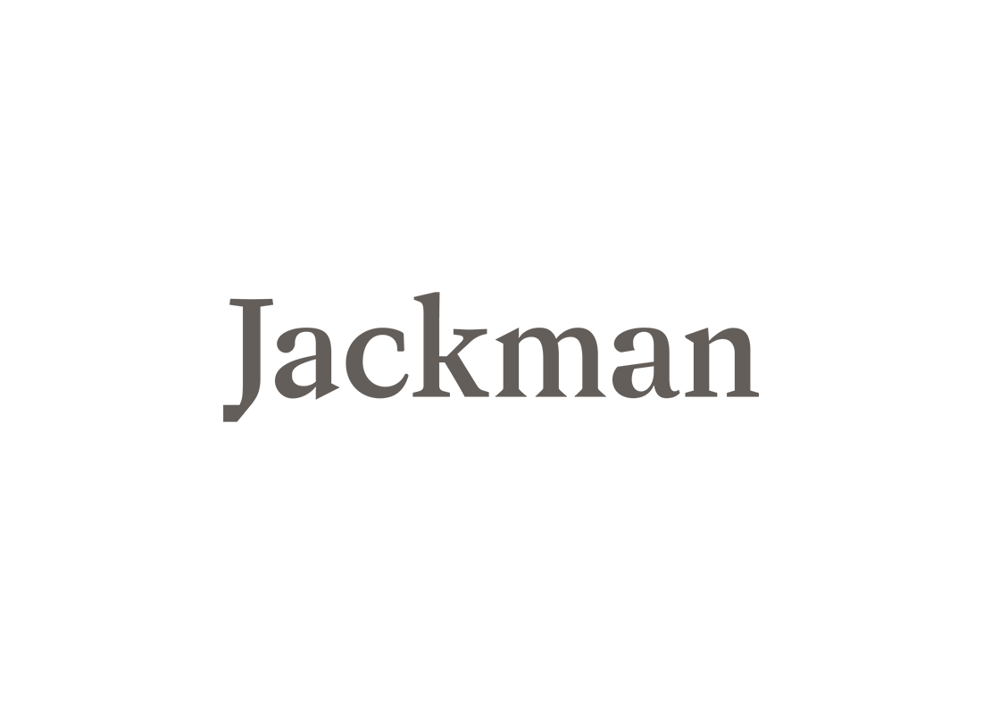
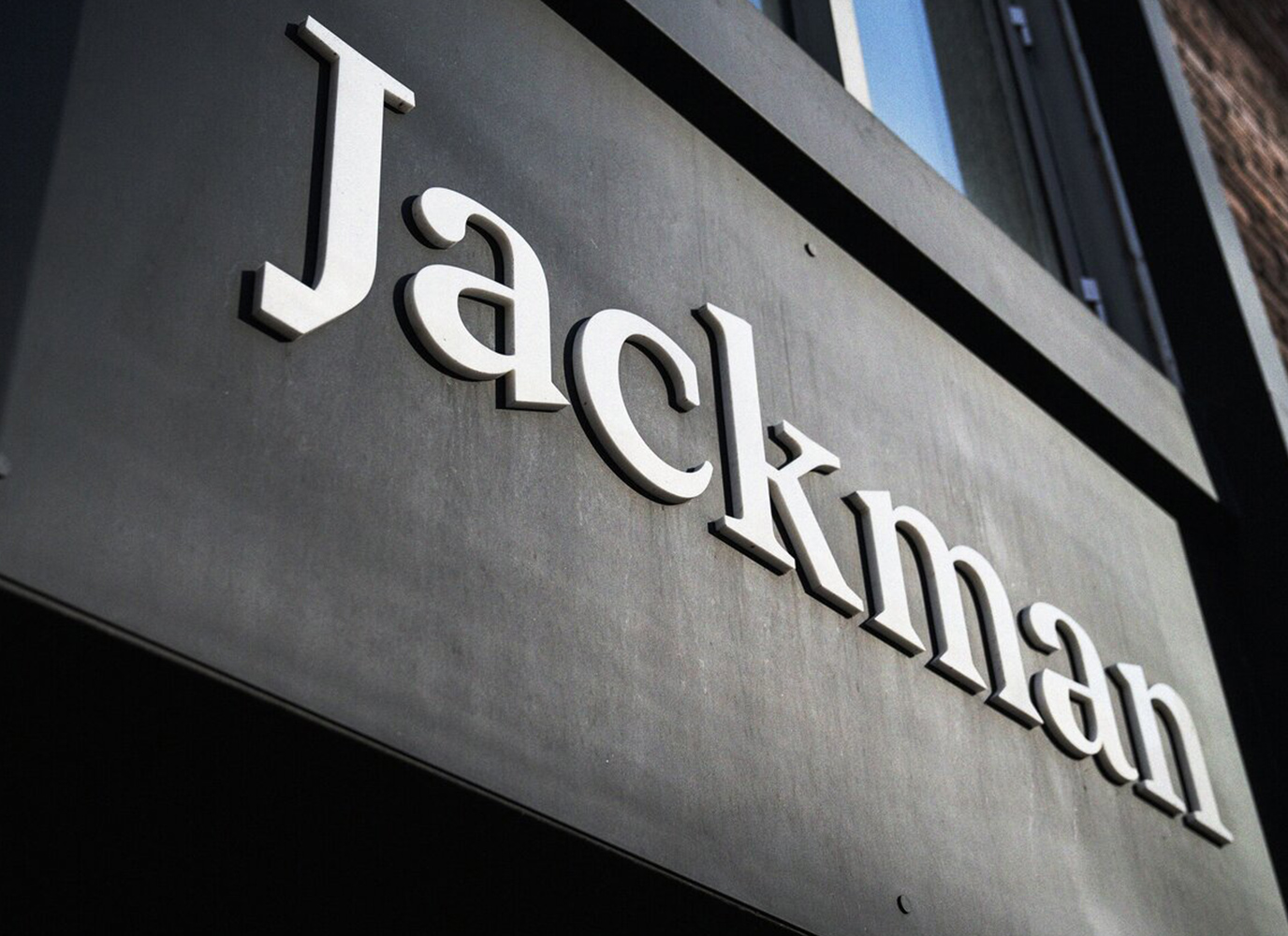
Jackman Logo
The concept behind the logo is one of diversity — each letter from a different typeface representing the wide range of talents on offer at this retail reinvention company. My role was to optically correct the letterforms so they would be more harmonious. This required careful refinement and placement of each letter to align stroke widths and create an even colour across the text while maintaining the unique characteristics of each character.


